A beginner-friendly financial health app that helps users build confidence and consistent money habits without overwhelm.
Behavioral UX
Product Thinking
Habit Formation

Platform
Mobile App
Timeline
Nov 2024 - Mar 2025
Team
Madison Plotkin
Angelica Arguilla
Johnny Tiangco
Hillary Co
Background
Many first-time budgeters want to save money and improve their financial health, but existing tools often feel intimidating, stressful, or overly complex.
I identified that instead of building confidence, these tools often reinforce anxiety, causing users to avoid engaging with their finances altogether. This revealed an opportunity to rethink financial tracking as something supportive and low-pressure, rather than demanding or overwhelming.
How might we help inexperienced users build financial confidence and self-sufficiency through consistent, low-pressure habits and clearer feedback about their financial health?
Design Objectives
Empower confidence in managing personal finances
Reduce overwhelm through a calm, approachable interface
Encourage consistency with small, repeatable habits
Support long-term behavior change beyond the app
→ Prioritize behavioral reinforcement over feature expansion, focusing on what would keep users engaged over time.
Understanding Users
We conducted semi-structured interviews with 13 participants to understand attitudes toward saving, budgeting, and financial tools.
Key Insights
7/13 users said saving money is very important, yet struggled to maintain consistent habits
Only 1/13 users felt confident tracking their personal finances
7/13 users relied primarily on bank apps and found them uninspiring or stressful
These findings revealed a clear gap between motivation and confidence.
→ Users didn’t lack awareness; they lacked systems that supported follow-through. This directly shaped my focus on encouragement, clarity, and low-pressure habit building.
Competitor Review
I evaluated existing products to understand how they support (or fail to support) beginner users:
Rocket Money: Simple and clear, but limited flexibility
YNAB: Powerful and structured, but intimidating for beginners
AGE-R: Motivating, but visually overwhelming
Takeaway: Motivation alone isn’t enough...
→ I found that it only works when paired with clarity and simplicity.

Visual Foundations
I designed Bud’s visual system to feel calm, supportive, and non-judgmental, recognizing the emotional weight of financial management.
Color palette: Soft greens, blues, and neutrals to convey trust and growth while avoiding anxiety-inducing contrasts
Typography: Corben for fun, friendly headings and Urbanist for readable body text
UI language: Rounded components and subtle shadows to signal approachability and interactivity
Exploring the Experience
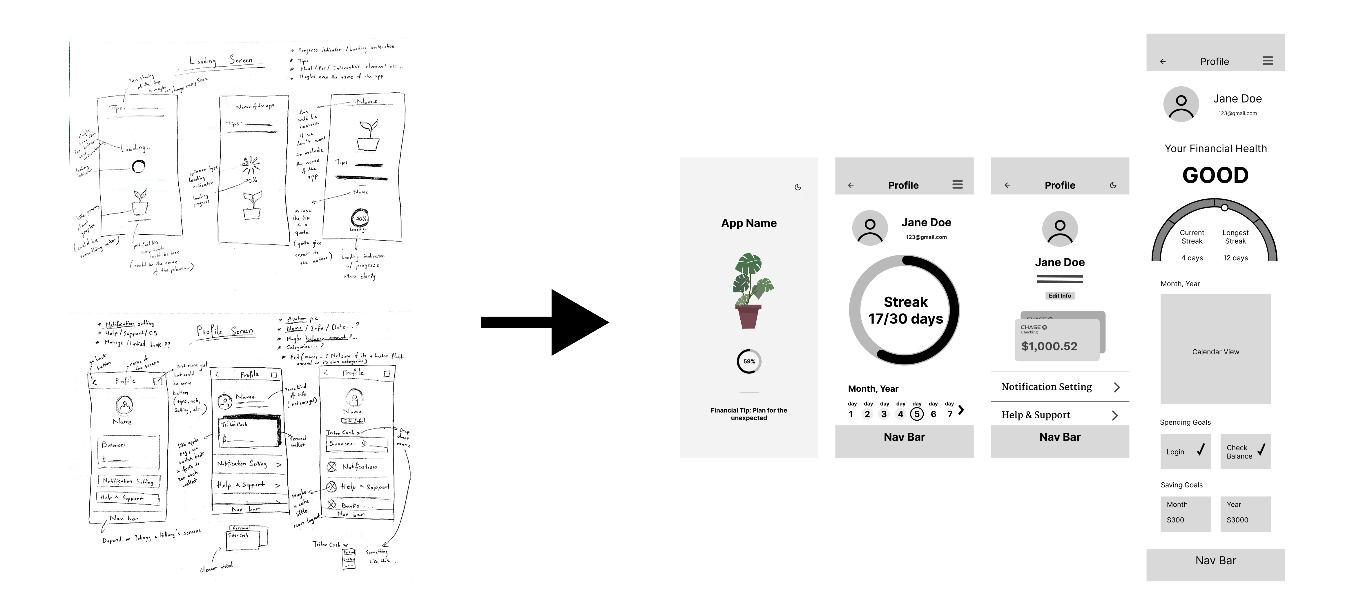
I designed the Loading and Profile experiences as a unified system to support users before, during, and after they engage with their financial data.
Rather than treating these as isolated screens, I used them to reinforce habit-building at different moments of the user journey.
Loading screen transforms wait time into a meaningful interaction by delivering brief financial tips and supportive microcopy. I intentionally used this space to reduce anxiety and introduce low-pressure learning moments instead of leaving it as dead time.
Profile screen focuses on clear hierarchy, low information density, and positive reinforcement. I prioritized streaks and simple progress cues to make consistency visible and encourage users to return.
Testing & Iterations
Usability testing surfaced several key issues:
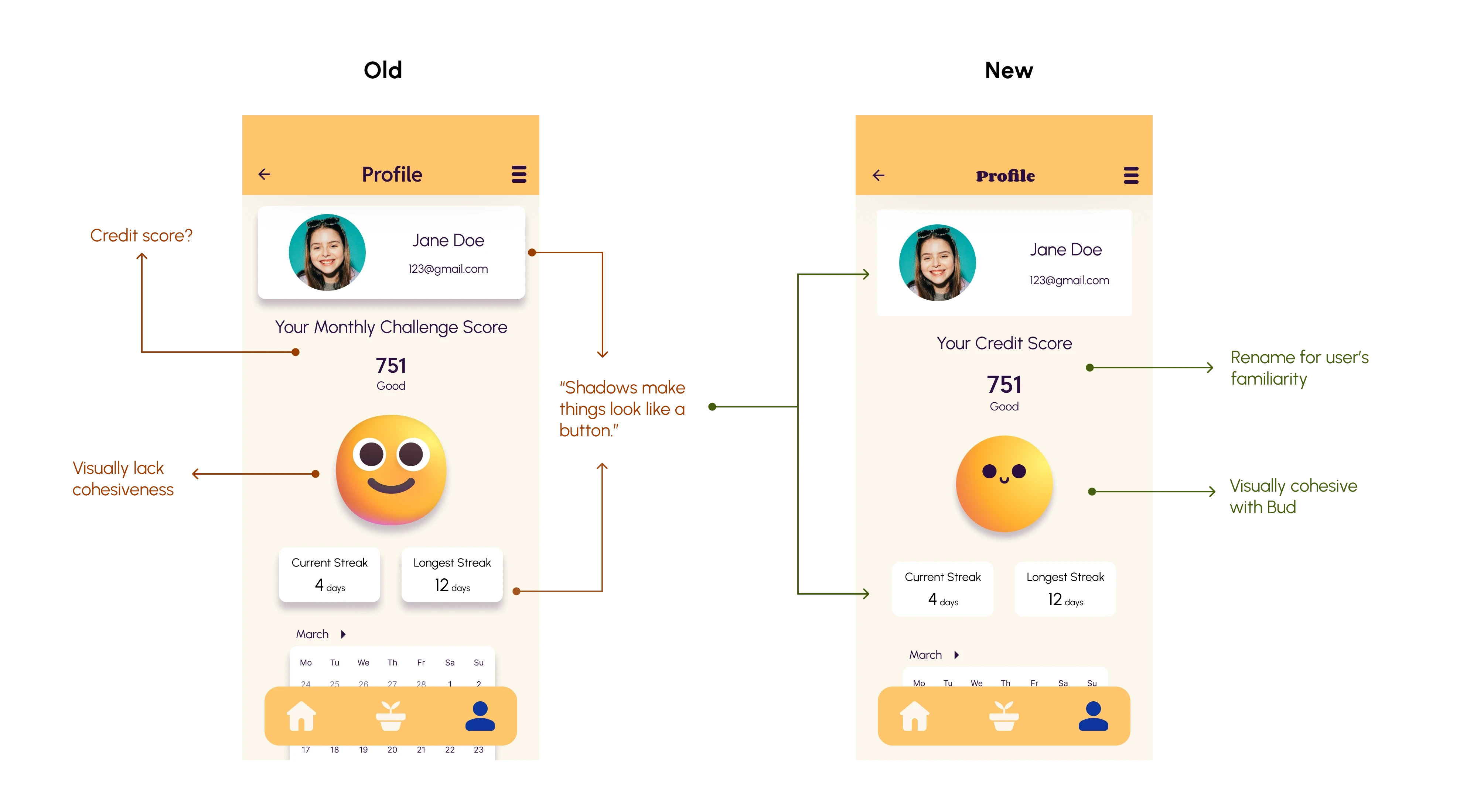
Users confused the financial health score with a credit score
Some interactive elements lacked clear affordances
Profile visuals felt disconnected from the app’s branding
“Shadows make things look like a button.”
What Changed
I addressed these issues by:
Renamed “Monthly Challenge Points” to “Credit Score” to align with users’ existing mental models.
Strengthened visual affordances (e.g., no shadows for un-tappable elements)
Improved visual cohesion between profile elements and the Bud identity.
I focused on removing ambiguity and ensuring that interactions felt obvious and reliable, rather than requiring interpretation.
Final Design
The final experience delivers:
Micro-learning loading screens that support users while waiting to enter the app.
A financial health score with intuitive context
A streak system that encourage daily engagement
A calendar-based progress view to reinforce consistency
Rather than emphasizing perfection, the design celebrates steady progress.
Impact
The Loading & Profile experiences were designed to build confidence, reduce overwhelm, and encourage small, consistent financial habits through calm presentation and supportive micro-interactions.
Success would ultimately be measured through usability insights, engagement patterns, and long‑term habit retention.
Reflection
What I've Learned
This project pushed me to slow down and design with empathy, especially around how people feel when managing money.
I was surprised by how much small, friendly interactions (plant or emoji feedback) could change the tone of the experience.
Iteration mattered most; feedback from teammates and user testing helped me catch blind spots and refine the design.
What I Could've Done Differently
If I could do this again, I’d run more user testing earlier, especially during mid-fi, to surface deeper insights sooner.
I’d also communicate more proactively with my teammates; overlapping features only became clear later, and sharing work earlier would have helped align the design before moving into high-fi.
What I'd Do Next
Expand usability testing to include a wider range of users and better understand different needs and behaviors.
I’d love to collaborate with developers for the feasibility of the app's micro-interactions.
Continue improving the screens, especially around insights, notifications, and goal-setting.
Bud reframes financial tracking as a supportive, achievable practice—helping users grow confidence one small habit at a time.
Explore the Prototype here